

Lifestyle photography is far more than decorative filler for magazines and blogs. It often determines whether a piece is simply read or genuinely felt. Especially for topics such as interiors, travel, food, wellness, family, fashion, health, or modern working culture, strong images help make situations feel plausible, relatable, and desirable. Anyone working in editorial content knows the effect: A text can be thoroughly researched — but if the visual language misses the mark, the piece loses credibility immediately.
For editorial teams, this creates a double challenge. Images must convince visually while also matching the editorial promise of the article. They should attract attention without looking like advertising. They should evoke emotion without tipping into the artificial. And they have to be selected under time pressure, even though, in lifestyle photography in particular, small nuances determine whether an image feels compelling or interchangeable.
This guide is not just about which lifestyle images look good, but above all about which images truly work for blog and magazine editorial teams. You will learn how to recognize strong lifestyle photography, which image types suit which topics, what can be learned from well-known photographers, and how to license images from IMAGO with legal certainty.
Why lifestyle photography is so effective for editorial teams
Lifestyle photography moves between documentation and staging. It does not show a pure product shot or a classic portrait, but rather a situation with atmosphere. That is exactly why it works so well for editorial formats. It does not simply illustrate a topic — it gives it context: Who is having breakfast there? What does this place feel like? What attitude, what milieu, what mood does the image convey?
This is especially important for blog and magazine editors because many lifestyle topics rely on recognizability. An article about work-from-home routines, sustainable fashion, modern fatherhood, or weekend getaways needs images readers can see themselves in. An overly polished stock photo creates distance. An image that feels too artificially charged shifts the focus from content to surface. Good lifestyle photography, by contrast, creates closeness without becoming pushy.
There is also an editorial advantage: lifestyle images are often flexible across formats. A strong scene can work in the header of a blog post, in an image series, as a social visual for an article, in a newsletter, or as a teaser image on overview pages. That very versatility is what makes selection demanding. The image must not only work in one format, but across several touchpoints.


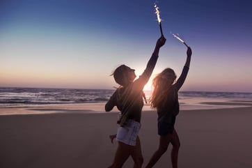
IMAGO / Image Source, IMAGO / Science Photo Library, IMAGO / Addictive Stock, IMAGO / YAY Images
What distinguishes good lifestyle images from interchangeable visuals
Not every bright, friendly, or trendy image is automatically good lifestyle photography. What matters is whether an image tells something without the text needing to explain it in full. Strong images often contain a small point of friction: a glance, a gesture, a detail in the room, an imperfect movement, a credible interaction. These elements turn a pretty photo into an editorially useful scene.
Interchangeable visuals are usually easy to spot. They show people visibly performing for the camera. Everything is tidy, symmetrical, flawless, and at the same time empty. The image feels like an illustration of “good vibes,” but not like a real moment from life. For editorial pieces, that is not enough, because such images rarely connect to the specific topic.
The key question is: Would this image still suggest a story even without a product name or headline? If the answer is yes, it is worth a closer look. If not, the visual will probably remain pure decoration.
1. Authenticity over posing: Why believable moments work better
The most important principle remains: Authenticity beats perfection. The original IMAGO article already emphasizes that lifestyle images should feel real and not overly staged. That is exactly what every editorial team should use as a guide. Readers notice very quickly whether an image feels observed or constructed. Scenes with natural body language, small irregularities, and plausible interactions create trust — and trust is a core value in editorial formats.
Authenticity does not mean randomness, however. A strong lifestyle image can be carefully composed and still feel credible. What matters is that people do not come across like placeholders. Hands should be doing something. Gazes should have a relationship to the scene. Clothing, surroundings, and props should fit the lived reality of the topic. An article about mindfulness needs a different kind of calm than a piece about urban weekend trends. A text about family life calls for different tensions than a piece about fine dining or boutique hotels.
For editorial teams, it is worth checking authenticity on three levels:
-
People: Do facial expressions, posture, and interaction feel natural?
-
Environment: Does the location support the story, or is it only a backdrop?
-
Action: Is someone in the image actually doing something that fits the topic?
If these three levels are coherent, the chances increase that an image is not only aesthetically strong, but editorially reliable.
2. Read natural light instead of just looking for “pretty light”
The original rightly names the use of natural light as a central selection criterion. Natural light makes lifestyle scenes feel more believable because it supports the impression of a real moment. Daylight, window light, or golden-hour light in particular creates a visual language that feels warm, open, and approachable.
For editorial teams, though, the more important question is not whether an image was shot “in natural light,” but how that light shapes the story. Bright morning light conveys a different tone than harsh midday light. Soft window light can create intimacy, which works especially well for topics such as self-care, working from home, or food. Side light emphasizes texture — ideal for food, interiors, or craftsmanship. Backlight can convey lightness and movement, but quickly feels generic if it is used only as an aesthetic effect.
In practical terms, this means: never evaluate light in isolation, but always in connection with the topic and the audience. For a calm magazine piece about mindful routines, quiet, reduced light may be more fitting than a spectacular sunset. For a summer travel feature, on the other hand, the light can tell the story more boldly.
A simple editorial check is: Does the lighting mood match the article’s message — or is it just pretty? Good lifestyle photography answers both at the same time.
3. Storytelling in lifestyle photography: Images need to do more than illustrate
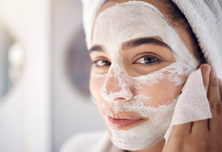
The fourth point in the original article is especially strong because it gets to the heart of good image selection: Lifestyle photography works best when it tells a story. A product, a place, or a person becomes more interesting as soon as it is embedded in a believable scene. The original uses the example of a face mask that is not simply shown on a plain background, but appears within a morning routine. That shift in perspective is editorially valuable.
For blogs and magazines, storytelling is therefore not an extra — it is a selection principle. An image should answer at least one of these questions:
-
Who is shown here?
-
What is happening right now?
-
Why is this moment relevant?
-
How does this scene feel?
The more answers an image already suggests visually, the less the text has to do afterward. Strong image series therefore do not just support the layout — they also support the language. This is especially useful in longer articles, because images create pauses while also reinforcing the flow of the argument.
Storytelling also means that the most obvious image is not always the best one. For an article about sustainable cooking, the perfect plated dish does not necessarily need to be the focus. A scene with prepared ingredients, used hands, an open window, and conversation at the kitchen table may work better. The story becomes larger than the product itself.
4. Details, spaces, and supporting scenes: How visual depth is created
Many editorial teams still select lifestyle images too one-dimensionally. They look for one “hero shot” that has to carry everything. In practice, however, supporting scenes are often what matter most. They create rhythm in long-form pieces and give topics depth. That is why a strong lifestyle image selection for an article rarely consists only of people shots.
A mix of three image categories is especially helpful:
-
Scene shots: People in action or interaction.
-
Detail shots: Hands, objects, textures, small gestures.
-
Environment shots: Rooms, landscapes, architecture, atmospheres.
Detail and environment shots in particular make an article feel more premium. They help structure topics without forcing the reader to keep looking straight into a model’s face. An article about Scandinavian living benefits from materials, light accents, and a sense of space. A piece about work-life balance gains from desk details, pause moments, or half-open doors. A food article becomes stronger when it shows not only the finished dish, but also preparation, hands, steam, tableware, and the atmosphere around the table.
From an editorial point of view: The longer an article is, and the more varied its scroll depth, the more important the visual dramaturgy becomes. Lifestyle photography then has to deliver not just one image, but a small visual world.
We advise you on the right images for your lifestyle project — including custom media packages.
5. Think about audience, medium, and format first
A common mistake in image selection is curating lifestyle photography purely by taste. What feels appealing gets saved. What feels atmospheric ends up on the shortlist. For a professional editorial team, that is not enough. What always matters is the question: For whom is the piece being published, and where will the image be seen first?
A print magazine can work with quieter, more subtle visuals because paper and double-page spreads invite time and attention. A blog header, by contrast, often needs an image that provides orientation immediately. A newsletter visual must work at smaller sizes. Social teasers need clear composition and a recognizable focal point. The same image series can therefore be useful in very different ways depending on the channel.
The target audience also changes the selection. An audience of design-savvy readers is more likely to accept reduced, artistic, or ambiguous images. Broader audiences often respond better to clearer scenes with more direct emotional legibility. B2B-adjacent lifestyle topics — such as hospitality, travel, wellness, new work, or brand communications — often require a visual language that feels inspiring while remaining professional.
A buyer-persona-based perspective is especially relevant for IMAGO because many users in editorial teams, marketing departments, agencies, and corporate communications work under time pressure, while also needing to publish with legal certainty. As a result, they tend to prefer visuals that are quick to find, easy to use, and consistently high in quality.
6. Vintage, trend aesthetics, and the zeitgeist: When style helps — and when it outruns the text
The original article names vintage aesthetics as the third trend. That makes sense, because analog or analog-inspired visual styles create closeness, nostalgia, and personality. In certain contexts — such as fashion, travel, music, interiors, or food — that can work very well.
For editorial teams, however, one rule applies: trend aesthetics should never be stronger than the topic itself. An overly dominant retro look can quickly date an article or create the impression that style has been placed above substance. Restraint is especially worthwhile in evergreen content. If an article is meant to remain search-relevant over time, images with a timeless atmosphere are often the better choice than visuals that only follow the current social media aesthetic.
That does not mean trends should be avoided. On the contrary, they can help signal relevance and timeliness. The important thing is that style is used consciously. Ask yourself:
-
Does the aesthetic support the message of the article?
-
Will the look still feel convincing in six or twelve months?
-
Does the image carry content — or only trend awareness?
If these questions can be answered positively, a contemporary or nostalgic style can significantly enhance the article.


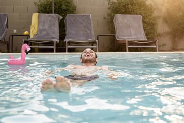

IMAGO / Zoonar, IMAGO / Science Photo Library, IMAGO / Image Source, IMAGO / Tetra Images, IMAGO / YAY Images, IMAGO / YAY Images
What we can learn from Annie Leibovitz, Martin Parr, Peter Lindbergh, and Slim Aarons
Famous photographers are not just reference names for editorial teams. They help sharpen the way we think about visual language. Anyone selecting lifestyle photography benefits from keeping four very different approaches in mind.
Annie Leibovitz: Closeness emerges through narrative layering
Annie Leibovitz is best known for portraits that do not simply show people, but place them within a broader narrative. That is exactly what makes her work useful for lifestyle image selection as well: a strong image does not just stage a person — it stages a world around them. Rooms, objects, body language, and direction of gaze all carry the story together. For editorial teams, this means: look for images that offer more than a face. Look for scenes where environment and person work together.
Martin Parr: The everyday becomes powerful when you look closely
Magnum describes Martin Parr as one of the best-known documentary photographers of his generation. His work shows how compelling seemingly ordinary everyday moments can become when color, timing, and social observation come together. For lifestyle editorial teams, that is an important reminder: not every strong scene needs to look luxurious or perfect. Sometimes relevance emerges precisely from the ordinary, when it is observed honestly and precisely.
Peter Lindbergh: Character over surface
Peter Lindbergh shaped a visual language that allowed for naturalness, personality, and a certain degree of imperfection. Kunsthalle Munich notes that, rather than artificial polish, he placed the character of his models more strongly at the center, bringing realism into fashion photography. For lifestyle photography, that means: images become stronger when they show people not only as attractive, but as credible. Too much retouching or too much perfection often weakens exactly that quality.
Slim Aarons: Lifestyle also works through place and milieu
Slim Aarons, by contrast, represents a very different form of lifestyle photography. Getty Images Gallery emphasizes his eye for luxury, leisure, and observed scenes that still should not feel artificial. For editorial teams, this is a useful lesson: lifestyle is not told only through people, but also through places, milieus, and social codes. Architecture, poolside settings, terraces, clothing, or table situations can already charge a story quite strongly — even when the scene itself remains understated.
These four references show how broadly lifestyle photography can be understood. Sometimes it is about intimacy, sometimes observation, sometimes character, sometimes atmosphere. That is exactly why it is worth making a clear decision before selecting images: What kind of lifestyle is the article actually meant to tell?


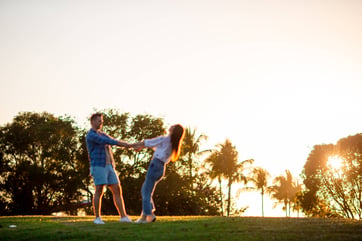
IMAGO / Addictive Stock, IMAGO / Panthermedia, IMAGO / YAY Images, IMAGO / Addictive Stock
A practical selection process for editorial teams
In day-to-day work, there is often no time to discuss dozens of visuals at length. A structured process can save a great deal of effort here. A short five-step check has proven effective:
1. Define the topic and the article’s core message
Before searching for images, there should be one internal sentence that defines the essence of the piece. Not just: “Article about summer recipes,” but: “Summer recipes that should feel uncomplicated, sociable, and suitable for everyday life.” That level of precision changes image selection immediately.
2. Define the primary image and supporting visuals
Decide what the reader should see first, and which visuals will deepen the text later on. That helps you avoid choosing images that all serve the same function.
3. Prioritize relevance over beauty
Ask this of every image: Does it genuinely help the article? Or is it simply pretty? Relevance almost always beats surface appeal.
4. Factor in channel and format
Check early on whether the visual works as a hero image, in teasers, on mobile, in newsletters, and, if needed, in print. That helps prevent late layout problems.
5. Check rights and usage scope immediately
The best image is of little use if the license does not fit the planned application later on. That is why rights checks should not be pushed to the very end, but handled alongside selection. Professional users in particular value clear usage rights, transparent licensing models, and efficient workflows, because this is exactly where time and risk arise in daily work.
Common mistakes when selecting lifestyle images
Many articles do not fail because of bad photos, but because of small selection mistakes. These patterns appear again and again in editorial work:
Overly polished visual worlds
If every person is perfectly styled, every room looks immaculate, and every movement feels visibly staged, the article loses credibility. Lifestyle thrives on controlled naturalness, not clinical perfection.
No clear connection to the topic
A beautiful image of laughing friends is not automatically the right visual for a text about mental health, workation, or sustainable living. Without thematic precision, the image choice remains arbitrary.
Too little variation in the image series
Only people, only faces, only wide shots, or only detail shots make an image series monotonous. Strong articles need variation in perspective, distance, and tempo.
Visual clichés
Certain topics keep triggering the same motifs: woman with salad, laptop by the window, couple on the beach, coffee in the morning. These images only work when they bring a surprising nuance. Otherwise, they feel like placeholders.
Rights review too late
Especially when multiple channels or later re-use are planned, an unsuitable license can create unnecessary loops. If you check earlier, you work with less stress. Professional decision-makers want rights-safe sources, transparent pricing and licensing models, and support in special cases for exactly that reason.
Storytelling with lifestyle images
Although the main goal of lifestyle images is to portray people’s lives, elements of product, fashion, or landscape photography are often incorporated into lifestyle series as well. For example, the popularity and use of product imagery is increasing because brands now want to market their products — whether cosmetics, handbags, jewelry, or clothing — in a way that allows customers to feel the brand identity and the lifestyle associated with it. That is why it is important to choose images that tell a story.
One example: If you are writing an article about a face mask, the visual material should not simply show the product against a plain background. Instead, you might choose an image of a model getting ready in the morning and applying the mask. This places the product in a vivid, everyday context, making it feel more tangible and attractive to people. They can identify with the situation more easily and are more likely to want to try the product themselves.


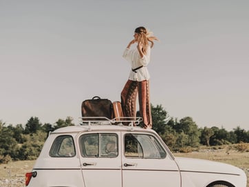
IMAGO / Zoonar, IMAGO / Pond5 Images, IMAGO / Pond5 Images, IMAGO / YAY Images
How these images can be licensed from IMAGO with legal certainty
Anyone publishing images almost always works in an environment where image rights, personality rights, and intended use need to be kept clearly separate. A license does not transfer ownership of the image — it governs the right to use it, while copyright remains with the respective creator or agency. That is exactly how IMAGO explains its licensing logic on its information pages and in its FAQ.
For practical use, IMAGO offers common licensing models that define the scope of use precisely:
-
Rights Managed (RM): generally for clearly defined, one-time uses, such as a specific article, a defined social media publication, or a specific print run.
-
Royalty Free Classic (RF): for repeated use without renewed per-use notification, depending on the version, for example as Standard or Extended.
-
Royalty Free Premium (RF Premium): for especially flexible projects, often with a broader scope, such as print, campaign elements, or packaging — provided the additional rights are in place.
IMAGO consistently lists these three license types in the Webshop, FAQ, and licensing information as RM, RF, and RF Premium. In addition, material is labeled directly on the image or video accordingly, so users can filter more quickly and choose the right framework.
It is also important to distinguish between editorial and commercial use. Editorial means reporting, information, and documentation — such as articles, chronicles, or teaching materials. Commercial includes advertising, sponsorship, product marketing, packaging, or merchandising and may require additional consents. This distinction is especially visible with sports imagery, but it applies just as much to lifestyle visuals once people, brand worlds, or private environments are used for promotional purposes.
As soon as people or private places and objects are clearly recognizable and the use becomes commercial, Model Releases and Property Releases may become relevant. IMAGO explains that the corresponding clearances are especially important when images are used for marketing, advertising, or other commercial purposes. Release status is indicated in the metadata or image text, and the search can be narrowed using the appropriate filters. For editorial teams, this is a practical advantage because release questions do not have to be clarified only after the image has already been selected.
The purchasing path is also relevant in day-to-day work. IMAGO makes three common options available:
-
Webshop — Single License for individual licenses tied to specific publications.
-
Webshop — Credit Packages for credits valid for 365 days, which makes them useful for regular needs.
-
Personal consultation for larger volumes, recurring requirements, or individual contract models.
For recurring formats, it also helps to take a quick look at the relevant internal sections so teams can make consistent decisions across series, blog formats, or cross-channel productions. According to IMAGO, clear licenses, flexible models, and personal support are an explicit part of the offer — along with tailored research support for professional users.
How editorial teams can build a stronger lifestyle visual language
A single strong article is helpful. In the long term, however, what really matters is whether an editorial team develops a recognizable visual point of view. That does not mean using the same look every time. It means defining shared standards.
Helpful questions include:
-
What balance do we want between documentary and aesthetic?
-
How much staging feels credible for our brand?
-
Do we prefer warmth, clarity, calm, energy, or urbanity?
-
Which clichés do we consciously want to avoid?
-
Which image motifs work especially well with our audience?
These kinds of guidelines accelerate day-to-day work enormously. They also help teams search more consistently within image databases. Instead of vaguely filtering for “beautiful lifestyle photos,” searches become more targeted — by situation, milieu, age group, activity, lighting mood, and emotional tone.
That can save a great deal of time, especially when working with a large archive and a wide range of subject areas. IMAGO positions itself on its own website as an image agency for media, sports, and brands with a very large inventory of images, videos, and stock photos. For professional editorial teams, that breadth becomes especially useful when it is paired with clear search and selection criteria.
Great lifestyle photography makes content credible, readable, and memorable
Lifestyle photography is strongest when it does not just look good, but works in an editorially meaningful way. The best images create credibility, tell a scene, fit the target audience, work across multiple formats, and remain close to the content despite their visual quality. That is exactly where their value for magazines and blogs lies.
Anyone selecting lifestyle images should therefore not rely only on trends or personal preference. What matters more is authenticity, light, context, narrative power, thematic precision, and a clear usage framework. The four core ideas from the original article remain correct — authenticity, natural light, vintage used as a deliberate style choice, and storytelling. For professional editorial teams, however, they only become truly useful when they are combined with a structured selection process, awareness of common mistakes, and legally compliant licensing.
If you are planning your next image series for a blog, magazine, newsletter, or cross-channel publication, it is worth taking a double look: first at the story the image tells, and then at the rights that permit its use. It is exactly at that intersection that beautiful lifestyle photography becomes a reliable working tool for professional content. For practical implementation, readers can start directly with Creative Images, review the right usage framework under Licenses, or coordinate more extensive needs with the Sales Manager.